Foundation Production

Brief: Create a front page, contents and double page spread of a new music magazine. All images and text used must be original, produced by the candidiate, minimum of four images per candidate.Technology: Digital photography and manipulation. Desktop publishing.

Tuesday 20 April 2010

Draft Of My Music Magazine


As you can see i literally changed everything. Firstly i changed the main image, this is because i feel my previous image didn't show any photo shop skills & also the picture that i previously had of the two artist, i felt they weren't close enough together, which meant that i couldn't fit all my sell lines.
I also edited the artist in the back, Mo Money. I used the tool colour replacement on photo shop to change the colour of Mo Money's tracksuit to purple & red, thus allowing me to use the two colours as a theme for this edition of my magazine & allowed me to use red & purple as my limited choice of colours, which is a convention used in nearly all magazines.

Draft Of Contents Page


This another draft of my contents page. As you can see i have added the colour purple in the background as a gradient tool, this is to add more colour to my contents page and it also links in with the colour scheme on my front page.

Draft of Double Page Spread - Page 1


This is the first page of the first draft of my double page spread. As you can see it is basic as i am trying to figure out the layout of my double page spread and this is a potential layout which could be used in my final draft of my double page spread.

Draft of My Double Page Spread - Page 2

This is the second page of my double page spread. Again i have kept it basic as im playing around with different ideas just to find out the right template which i will use in my final copy of my music magazine.

Preliminary Task


This is my contents page for my school magazine, this is also part of my preliminary task. I didnt know what features a school magazine would contain so as you can see my contents page is basic. At this stage i was still unfamiliar with photoshop.

Preliminary Task


This is my preliminary task, this is the first time i used photoshop and i now i feel that i have improved my photoshop skills which can be seen in my final draft of my music magazine.

Question 7 Evaluation

Auidence Feedback

Auidence Feedback

Positives about my magazine:
- It appeals to to the right type of auidence
- It fits the typcial sterotype of what a grime magazine would be like
- It contains many conventions which you would expect to see in a music magazine
- The double page spread is very realistic, and has a lot of formal language which is a convention in main articles in a music magazine
- The question asked in the double page spread were good and the answers contained a lot of information about the artist and thier background
- The images on used in my double page spread were effecive as they fited with the floating quotes
- The images and the features used on my contents page was effective as it was easy for the auidence to find what they were looking for

Negatives about my magazine:
- The front cover should have more sell lines
- The contents page should have been more organinsed and needed to look more conventional
- The contents page should have had a better colour theme in the background
- The double page spread should have contained more questions
- The front cover needs to contain a background

Monday 29 March 2010

Draft Of Contents Page

18/3/10

This is my fourth draft of my contents page. As you can see i have gone for a plain white background as this is a convention used in most contents page backgrounds.
I highlighted the most important features of my contents page, an example of this would be " Interviews, Regulars & Tour Info". I decided to do this as i felt it highlights the features, thus attracting the audience & making the particular text stand out from the regular text.
I have also included a editorial, which nearly all magazines have on their contents pages. I have also included images of other artist that will feature in my magazine which isn't usually a convention in some hip hop magazines however, my magazine is a Grime magazine, which is why I'm challenging the stereotype of what a hip hop contents page would look like.

I want to add more colour to the background, which you will see in my final draft as well as other minor adjustments.

Draft Of Contents Page

18/3/10
This is the 3rd draft of my contents page. As you can see i havent changed the background colour. This is because i wanted to see if my contents page would look any better with text on it and a couple of images, however this hasnt changed my mind and i think my contents page would look better without the red and white strips.

Draft Of Contents Page

18/3/10
This is the second draft of my contents page. As you can see i have added red and white strips in the background, as on the front cover red was 1 of 3 colours i used.
However i feel that it looks a bit childish and not conventional of what a music magazine contents page would look like. So i expect to change the background by the end of the day.

Draft of Front Cover

16/3/10
This is my 3rd draft. As you can see I have blurred out the middle finger of my model as you wouldn't see this on the front cover of a music magazine. I've also changed the name of artist as know there names are more realistic. I've also changed the font of my magazine to "Rockwell Bold" as it stands out more and it looks more masculine. I've also made the artist name in 3d to make it stand out from all the other fonts on my front cover and it tells the audience what this issues will be about and also makes the artist be the most important thing on the front cover.

Saturday 27 March 2010

Images that didn't make the cut.


Draft Of Contents Page

13/3/10
This is the 1st fraft of my contents page. This isnt what my final contents page will eventuallt look like. Right now im just looking at different types of layout for my contents page. I want to go against the typical convention of what a music magazine contents page would look like, this is because im making a magazine which would be the 1st in its genre, so i have to stand out from the crowd.

Monday 22 March 2010

Draft Of Contents Page

18/3/10

This is another idea i have about my contents page. Although i've already completed my contents page, i like the idea of the layout on his draft, so i might be tempted to change my contents page before the deadline.

Wednesday 17 March 2010

Draft of Front Cover


11/3/10

This another draft of my front cover. As you can see i have got rid of my logo as well as changing the genre of my magazine. I have successfully managed to get my main image but i am expecting myself to make more changes to my front cover.


The reason i decided to call my magazine " Grime Weekly" is because in my questionnaire the majority of people said they would buy magazines weekly, which isn't a convention of a typical music magazine as most magazine tend to release a issues every month.

As you can see i have kept the sell lines as they are a typical convention, however in my next draft of my front cover i will change the name of my artist i have written about on the front page, this is because they are not names you would associate with grime artist. I will also be changing the main image as i think i can get a better image to make my magazine look more realistic.

Questionnaire results

Draft of Front Cover


11/3/10

This is another of my front cover. As you can see i have got rid of my logo as well as changing the genre of my magazine. I have successfully managed to get my main image but i am expecting myself to make more changes to my front cover.
The reason i decided to call my magazine " Grime Weekly" is because in my questionnaire the majority of people said they would buy magazines weekly, which isn't a convention of a typical music magazine as most magazine tend to release a issues every month.
As you can see i have kept the sell lines as they are a typical convention, however in my next draft of my front cover i will change the name of my artist i have written about on the front page, this is because they are not names you would associate with grime artist. I will also be changing the main image as i think i can get a better image to make my magazine look more realistic.

Monday 1 March 2010

Draft of Front Cover

1/3/10
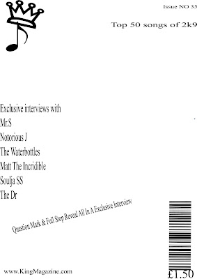
This is my first draft of my music magazine. As you can see, i have many conventions on the front cover, such as sell lines, a bar code, issue number, website along with the main headline and what could be my logo. This is a rough idea of the layout which i hope to use in the final cover of my music magazine

Monday 22 February 2010

Production Log

I sketched the first draft of my front cover on the 27th of January. At the moment the title of my magazine will be a picture of a crown, which connotes a king, so my title will be king of grime. The grime will be graffitied on my cover because grime music is usually underground and is usually distributed on the streets. At the moment the colours i will use will be, White, black and red. I have chosen white to be the colour of my background as everything i put in the foreground will stand out. The red will be used to highlight the important text also the colour red suggest danger, which is usually linked in the music produced by artist in the grime scene. The black will be used as the basic colour of most of the text, as it will stand out more against the white background.
My magazine will contain many conventions you would expect to see on a music magazine, such as a website for the audience to view exclusive gossip and stories about the artist, i will also have many sell lines which you can see in my first draft of my magazine along the sides. As well as the sell lines i will include a barcode and a main story to attract my Target audience.

Thursday 18 February 2010

Contents Page Analysis


The contents page of most magazine address the audience directly as it seems almost as it is talking to the audience, this contents page consist of many example, such as " Who's got all the cash?". The use of a rhetorical questions involves the reader and makes it seem as if they are having a conversation, which leads to a gain in sales as the readers like being addressed directly. Another way the contents page addresses the reader is through the use of the main image. 50cent looks directly at the camera, makes the audience feel as if he is looking at them.

This is a contents page from a music magazine called "In The Mix". As you can see it has many conventions which you would expect to see on a contents page of a music magazine.
One convention is the fact that it has many subtitles on the right hand side of the page along with numbers to help the audience find what they are looking for, such as the artist and stories featured inside the magazine. This also helps the audience to understand what type of genre this music magazine is, for example this contents page has an image of famous rapper 50cent, which tells the audience that this issues will be about the rapper and gives us information about the target audience. In addition to this 50cent is shown as a stereotype of a rapper, we can see this through the mise en scene as he is wearing baggy jeans and a t shirt with his gang "G unit" written on it, he also gives a mean look to camera man suggesting he is angry, also the sub headings also give the audience an idea of what the magazine will be discussing.

Another convention which is being used is the limited colours involved on the contents page. There is only two colours being used, black and red which could be the colours which feature in every issues of "In The mix". This is used to make the magazine look more sophisticated and it is easier for the magazine to use limited colours because they make many issues of their magazines.

However the fact the this contents page has the issue number on the inside isn't a convention, as in most music magazine it is shown on the front cover, This may lead to a loss in sales as consumers might not purchase the magazine because they would not be sure weather it is a magazine they have previously read.

Wednesday 17 February 2010

Contents Page Analysis


The contents page of most magazine's address the audience directly as it seems almost as it is talking to the audience for example it says 'Chris rock is back' suggesting that you are telling someone that he is back therefore making the magazine seem as it is addressing you directly which is going to have more of a successful impact as it makes the reader feel more involved with the magazine and it also makes it seem more personal, this also suggest that the audience is in the know about all the gossip. This contents page is from Vibe magazine, the content page has a lot of typical conventions of a music magazine contents page. An example of a typical convention would be the page numbers written down to each story, which allows the audience to find what they are looking for quickly. Another convention would be the that the colours are limited on the contents page as they would be on the front cover, also the text would be the same as it would have been on the front cover, this is too make the magazine look more sophisticated. An additional convention would also be the fact that, they have their website written on the contents to allow the audience to view latest news and information on artist whenever they like and also shows how Vibe magazine have become an convergence industry in recent years, and this suggest why there is a decline in people purchasing music magazines. In addition to this the pictures along the side suggest that this magazine also talks about fashion and the clothes they are wearing suggest the target audience for the magazine. Nearly all contents pages contain images on them to allow the audience to see at a quick glance who will feature in the magazine.

However it could be argued that this contents page is going against what a typical contents page of a music magazine would look like, this is because the contents page seems to be 3 pages long when most magazines such as XXL or Billboard magazine tend to use a just 2 pages, maybe this is because they want the had many artist and topics to cater for in this Issue.
However this contents page also has another typical convention which is the image, which allows the audience to see which musician is featured in the magazine and also gives the audience an idea of who the target audience is for the magazine.

Tuesday 9 February 2010

Textual analysis - T.I.

Vibe magazine is a music and entertainment magazine which was launched in 1993 by founder and music producer Quincy Jones. Vibe is a famous music magazine and is know world wide for featuring famous musicians such as Chris Brown, Kanye west, Usher and Beyonce.
The front cover of this issue of Vibe shows T.I, a rapper who has recently made it big in the music industry, this suggest that the magazine is up to date with the music industry. T.I is dressed as a successful business man. The use of a suit, hat and glasses take the audience away from the stereotype of how rappers usually dress. The suit also sets out the colour scheme of the cover which is white, black and red. I think the text highlighted in red suggest these are the main topics of this issue of the magazine. E.g " Ain't no such thing as a secret snitch" as well as the sell lines on the right of the magazine, " 50cent, Prince, Lauryn Hill, DR.Dre, Jay Z and Biggie" in addition the fact that "Vibe" is also highlighted in red suggest that I'm right. This front cover shows typical conventions of a music magazine front cover, the fact that the colours are limited, the use of many sell lines along the side of the main image, the lead story on the right of the main image. However the fact that the masthead is in front of the main image is a surprise as in other issues of vibe it is usually behind the main image also the fact that their is no bar code on the cover is surprising.
The sell lines as well as having T.I on the front cover tells me that this magazine targets Hip hop and R&B lovers, aged 16 - 30.
The audience are being addressed through T.I as many of his lyrics are about his struggle in life and how he lived on the ruff streets of Atlanta, which targets people who might be in he same situation he was in, also most of his songs target people aged 16 - 30, which is also the target audience for the magazine, so the use of T.I allows them to target a mainstream audience. Also the fact that the image of T.I looking straight at the camera, suggest that he is looking at the audience.

Wednesday 3 February 2010

Textual Analysis - Soulja Boy


Billboard magazine is a leading music magazine in the USA. They are referred in many songs which show how popular they are. Billboard also has their own charts and awards which make them very important to the music industry. Billboard magazine specialize in many genres, such as Hip Hop, R&B, Rock and Pop.
This front cover tells me that the magazine is targeting people aged 14 – 25. I think this because Soulja Boy is a renowned rapper who is just 18 years old, thus leading me to believe that billboard are trying to target the same audience, Soulja Boys music targets. I think this also suggest that this issue of the magazine will be about hip hop as it has Soulja Boy on the front cover but one of their sell lines also suggest it will be about hip hop. “Lil Wayne leads Grammy noms”, which is an award in the music industry. Lil Wayne a notorious rapper know well wide, also there is a lot of media frenzy around this particular rapper. However billboards other sell lines suggest that this issue will not strictly be based on hip hop as they talk about “The Beatles”, furthermore they talk about CBS radio and how they strike another online deal. This also tells me that this magazine talks about more than musicians, the talk about every part of the music industry, which allows them to target a more mainstream audience.
The colour scheme used on the front cover is white and yellow, as you can see in the background the “B and the D” are coloured in with red and yellow and Billboard is written in white which are traditional colours of billboard and these colours will always be seen on the front cover of a billboard magazine.
I also feel that the magazine highlight the most important features of the magazine. E.g. “Soulja Boy and Lil Wayne are written in bigger text than the other sell lines, which suggest they are the most important features of this issue of billboard. The audience are being addressed through Soulja Boy. I think this because people who are fans of Soulja Boy are most likely to but this edition of billboard, also through the use of mise en scene. The jewellery he is wearing suggests that, the music industry is all about money and power and who has the most “bling”. If you look at the jewellery Soulja Boy is wearing it is all covered in gold, which connotes that he has made it.

Wednesday 27 January 2010

Production log 27/1/10


I sketched the first draft of my front cover on the 27th of January. At the moment the title of my magazine will be a picture of a crown, which connotes a king, so my title will be king of grime. The grime will be graffitied on my cover because grime music is usually underground and is usually distributed on the streets. At the moment the colours i will use will be, White, black and red. I have chosen white to be the colour of my background as everything i put in the foreground will stand out. The red will be used to highlight the important text also the colour red suggest danger, which is usually linked in the music produced by artist in the grime scene. The black will be used as the basic colour of most of the text, as it will stand out more against the white background.
My magazine will contain many conventions you would expect to see on a music magazine, such as a website for the audience to view exclusive gossip and stories about the artist, i will also have many sell lines which you can see in my first draft of my magazine along the sides. As well as the sell lines i will include a barcode and a main story to attract my Target audience.

Tuesday 19 January 2010

Textual Analysis - Cam'ron

XXL magazine has been the leading music magazine in the last 5 years. They specialise in hip-hop, Rap and R&B music. I know this because the image on the front cover is off a famous US rapper Cam'ron. Also XXL is famous for having many other singers and rappers on their front cover, an example of this would be US rapper NAS, Eminem, Jay Z as well as Young Jezzy, who are all the leading rappers in their calibre. Also Cam'ron who is the main image on the front cover is wearing a lot of jewellery, suggest that this magazine is also about image and who's got the most money as well as power in the music industry. The target audience for XXL magazine would be people aged 16 - 25. I think this, because topics which feature in the magazine have a lot to do with teenagers and most musicians who feature in the magazine, their music targets 16 - 25 year old. The sell lines in the magazine suggest that XXL have inside information about different rappers, also under the image of cam'ron, the text says “The dipset founder finally speaks of 50, frenemies and the future". This suggests that the audiences are eager to hear about the fights between rappers and how their career is going. In addition to this, XXL use slang in their headlines which tell us that they are targeting the youth, because older people don't usually use slang or even know what it means. E.g. "frenemies" also "50" only their target audience would know that "50" is 50cent a famous universal rapper.
The front cover is a medium close up shot of cam'ron, he is placed in the centre of the front cover to show he is the most important convention on the cover. The background colour is black which matches with cam'ron's t shirt, which seems to be the theme of this edition of the magazine, also the XXL sign is in red and white which makes it stand out. Also cam'ron used to be part of the notorious gang the bloods, which can explain why the writing below him is in red, in addition to this the colour red connotes danger and cam'ron is known for starting "beef" with other rappers, also cam'ron's name on the magazine looks as if it is sprayed on the magazine like graffiti which you usually see in the ghetto, where gangs tag their gang sign. If you look at the way Cam'ron is dressed, it is a stereotype of how we portray rappers in the music industry. I think the audience is being addressed in by the front cover through the choice of musician. Cam'ron is not a universal rapper, he is known more underground in the USA, so not everyone will know who he is; this issue magazine targets a niche audience as opposed to XXL who target a mainstream audience. In addition to this, the clothes Cam'ron wears targets the youth of today, which can also been portrayed by the jewellery he wears in the photo shoot, which suggest to the target